eGov Digital Product (NDA)

Client Background
Our client is a forward-thinking company operating in the eGovernment domain, focused on improving digital public services through a unified product ecosystem.
At the time of engagement, the product existed across platforms, each evolving independently. This resulted in inconsistent UI patterns, and increased complexity for both users and developers.
Challenge
The client approached us with the following objectives:
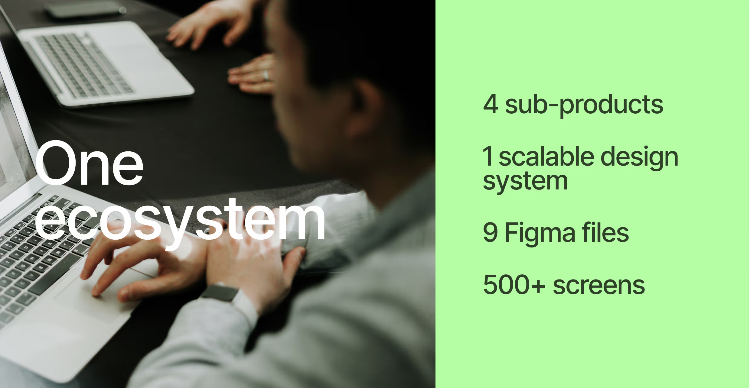
- Create ascalable, cohesive design systemacross all platforms
- Developclear documentation and specificationsfor the development team
- Update and improve UXacross the ecosystem
- Redesign themobile experience and interaction patterns
- Prepare the product for long-term scalability
Research:
Initial Research:
We clarified the product’s core value: The platform needed to balance complex administrative logic with clarity, accessibility, and ease of use. We mapped the ecosystem using a Business Model Canvas to align: user needs, stakeholder expectations, technical constraints, long-term business goals.
Based on initial analysis, we formed key hypotheses, including:
- Inconsistent UI patterns increase cognitive load and slow down task completion
- A unified design system would reduce development time and errors
- Clear UX patterns would improve adoption across different user roles
In-depth interview sessions:
We conducted 8 in-depth interviews with users representing different roles within the system.Focus areas included: daily workflows, pain points across platforms, feature discoverability, mobile usage scenarios.
Review Sessions with Users:
Early concepts and UX directions were validated through on-site review sessions, allowing us to: test assumptions, validate navigation and flows, identify friction points early. The insights from these sessions directly influenced the product structure and interaction patterns.


Product design:
File organization and hierarchy:
We designed a clear, scalable file hierarchy that brings consistency across the entire product ecosystem. The structure ensures logical grouping, easy navigation, and long-term maintainability. Unified design tokens (colors, typography, spacing, components) were implemented across all files to guarantee visual and functional consistency between platforms, features, and future product iterations.
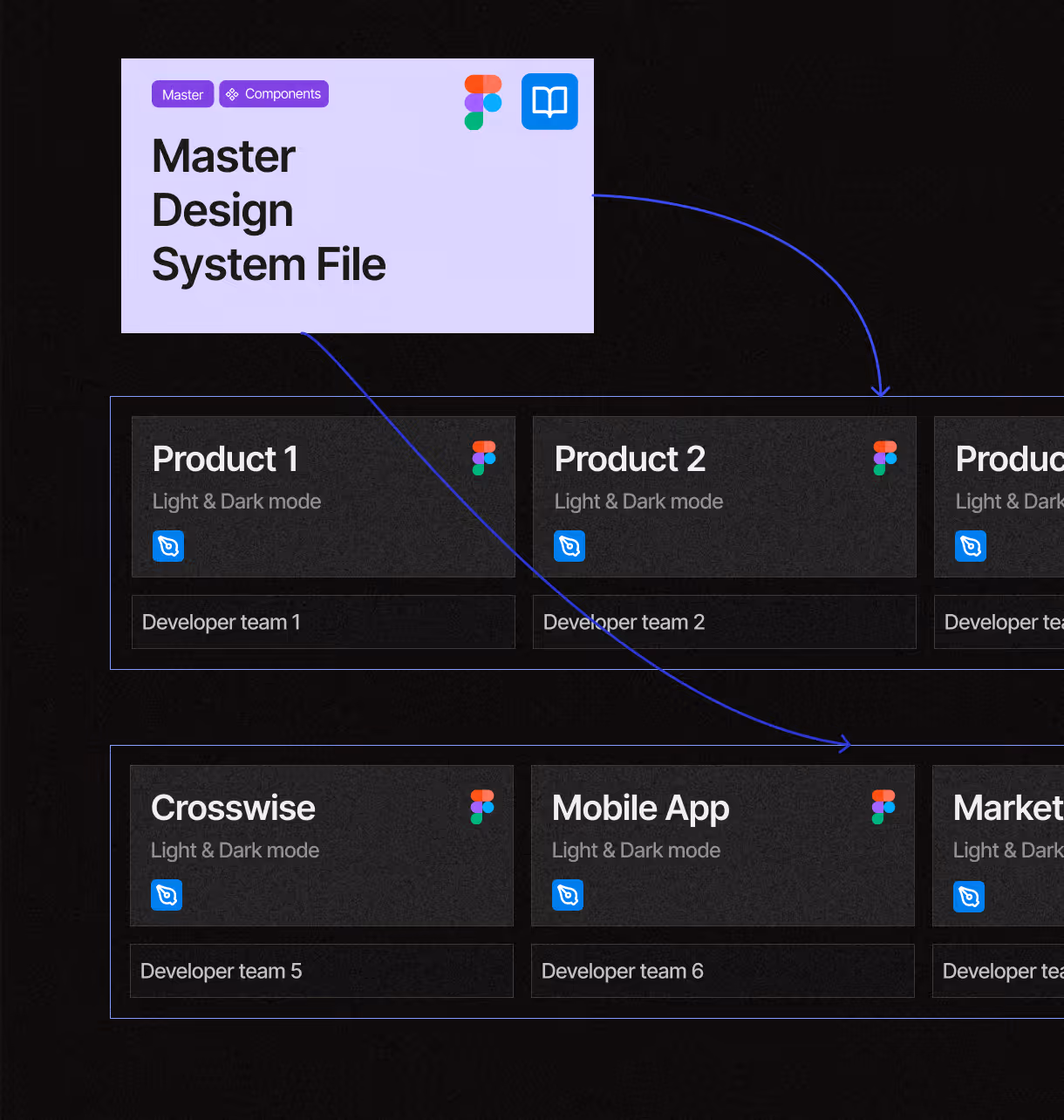

Scalable Design System & Documentation:
We built a scalable design system that supports rapid product expansion without sacrificing consistency or quality. Each component and flow was delivered with detailed specifications for developers, including states, spacing, behavior, and responsive rules. This reduced ambiguity, sped up implementation, and minimized design–development gaps during handoff and iteration.
Wireframes:
We started with low- and mid-fidelity wireframes to: define information architecture, align flows across sub-products, ensure consistency before visual design.

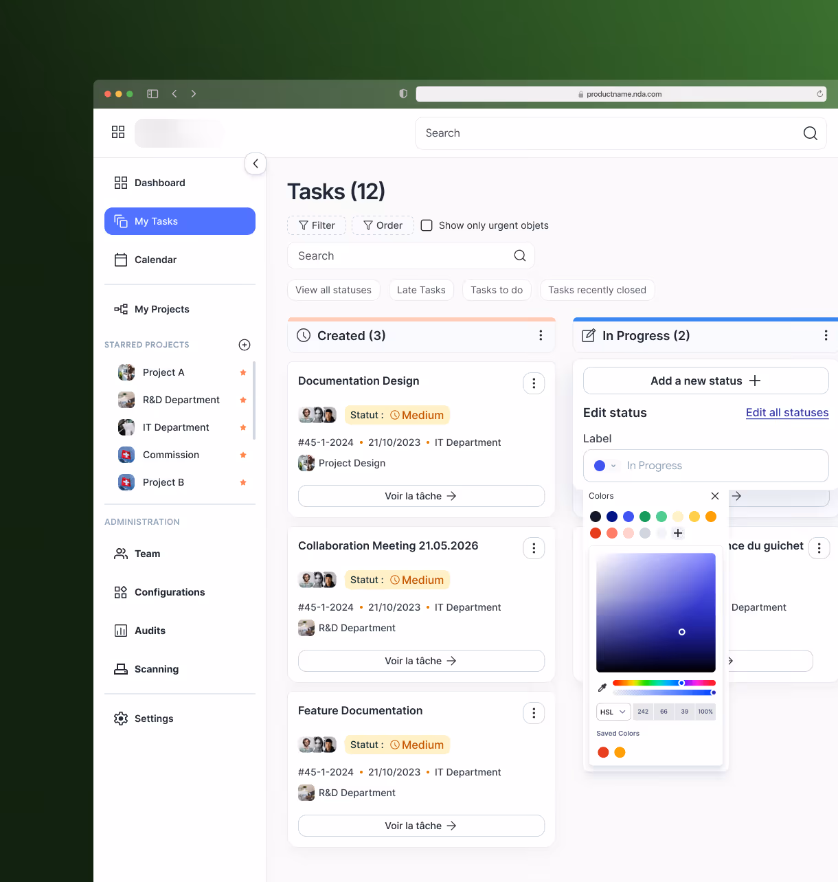
Functionality
Core Functionalities Designed:
Each functionality was designed as an integral part of the interface, following shared patterns to ensure consistency across the ecosystem.


Mobile experience:
We designed a fully responsive mobile experience with a strong focus on cross-platform usability. The scanning functionality was optimized for real-world usage, ensuring speed, clarity, and reliability across different devices and operating systems.


Outcome
As a result of the project, the client received:
- A cohesive, unified design system across all platforms
- Clear design documentation for developers
- A fully redesigned product ecosystem
- Improved usability and consistency
- Positive client feedback and alignment across teams
The new system is scalable, maintainable, and ready to support future product growth.
Talk to us
Book an
introduction call
- Book a 30-minute call with the CEO
- Get a tailored proposal within 1-2 business days
Tell us about your
project
- Book a 30-minute call with the CEO
- Get a tailored proposal within 1-2 business days